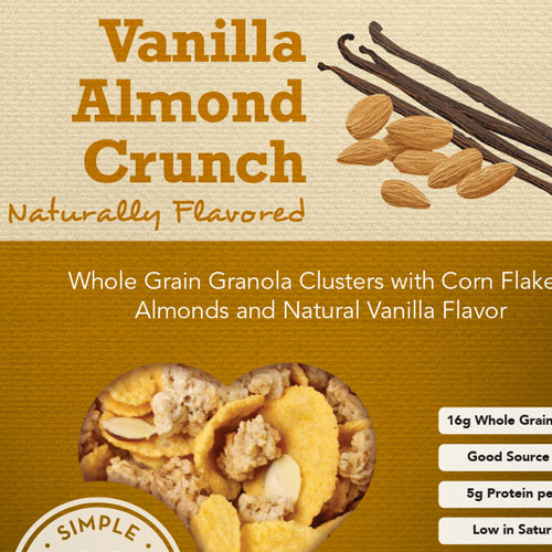
Wholesome Goodness
Better-tasting and better-for-you
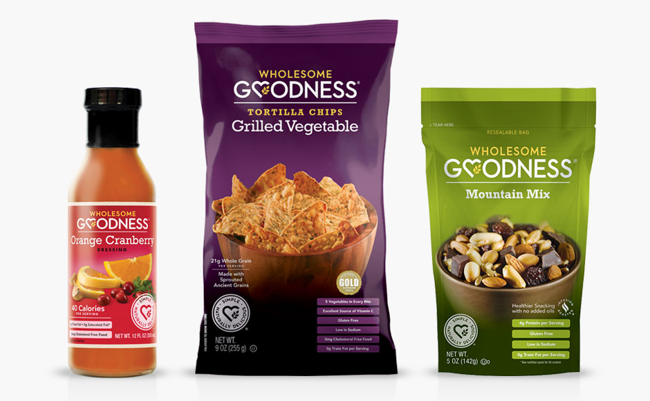
Appalled by the salt, sweeteners, and chemicals saturating popular food items, the founders of Wholesome Goodness set out to create products that were more nutritious while still being enjoyable to eat. When the company came to me, they had established a solid and appealing brand identity – but were looking for someone who could maintain and evolve the brand over the long haul.
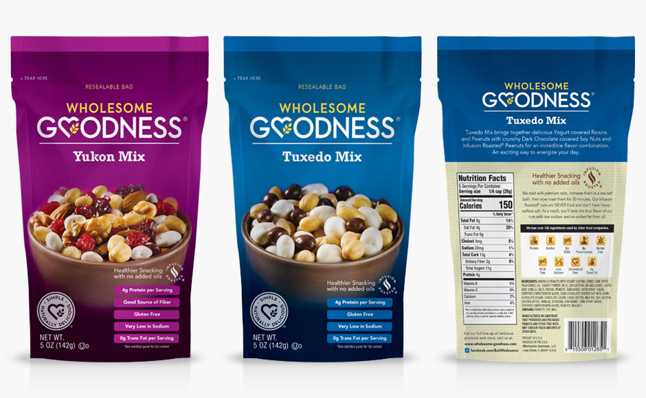
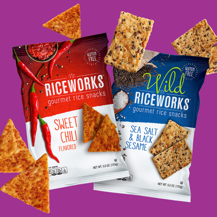
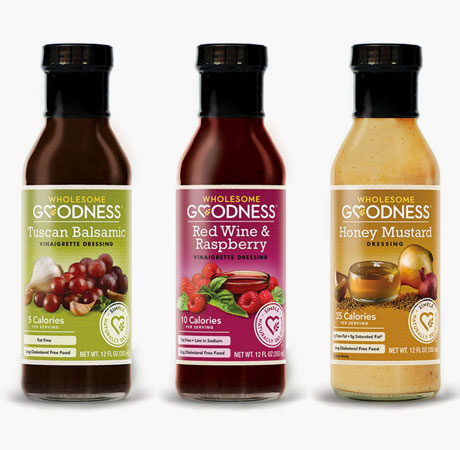
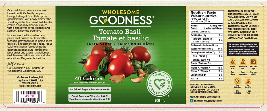
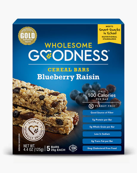
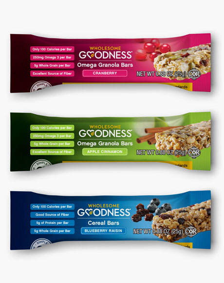
Brighter, bolder packaging features flavor
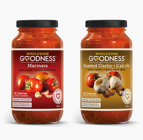
The first round of packaging, while unified by the logo and certain visual elements, had significantly different appearance over different product lines. Early on, we decided that bold-colorful packages best reflected the company’s focus on great flavor. As new products were added and existing ones refined, we’ve updated all packaging so now company is presenting a unified brand identity in stores.
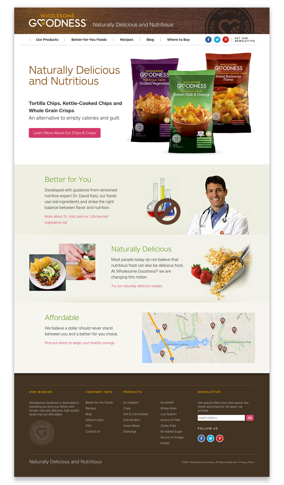
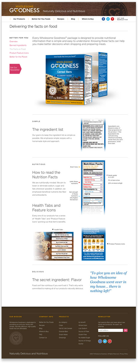
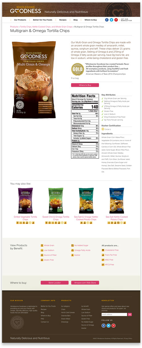
A website focused on key brand messages
The original website was a hand-coded and very difficult to update. Along with a redesign that focused on the company’s key brand messages and easy access to product info and store locations, the site was built on WordPress to enable easy updates to news and recipes.
